
I Experimented With AI Design Tools On A Real-World Take Home Design Challenge
Take home exercise end-to-end design process & the results from AI design tools
Everyone says designers should experiment with AI design tools, but very few show what that actually looks like on real work. So I documented how I used AI design tools, end-to-end on a real product design take-home.
This is how I used AI design products like v0 and FigmaMake as part of the process, not to replace my judgment, but to accelerate understanding, exploration, and iteration.
For this piece, I’m using A PD Take Home Exercise
Things AI is an incredible partner in the parts of the work that are:
synthesizing large specs and solidifying your understanding
generating wide no. of options for inspiration
running your assumptions against market data and stats
stress‑testing flows and logic
Here’s what that looked like for me on this specific take‑home.
Some details have been redacted so this article focuses on sharing my design process
—
Step 1: Understanding (╭ರ_•́)
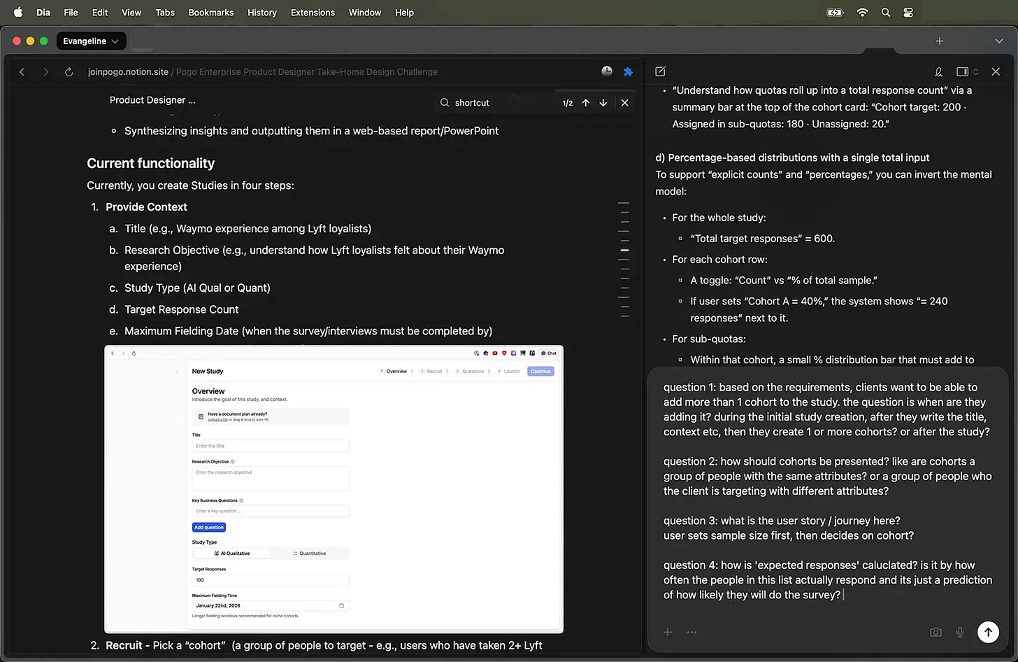
I start as anyone would expect - I read the take‑home.
I’m mainly trying to understand the ask & the scope.
This looks like:
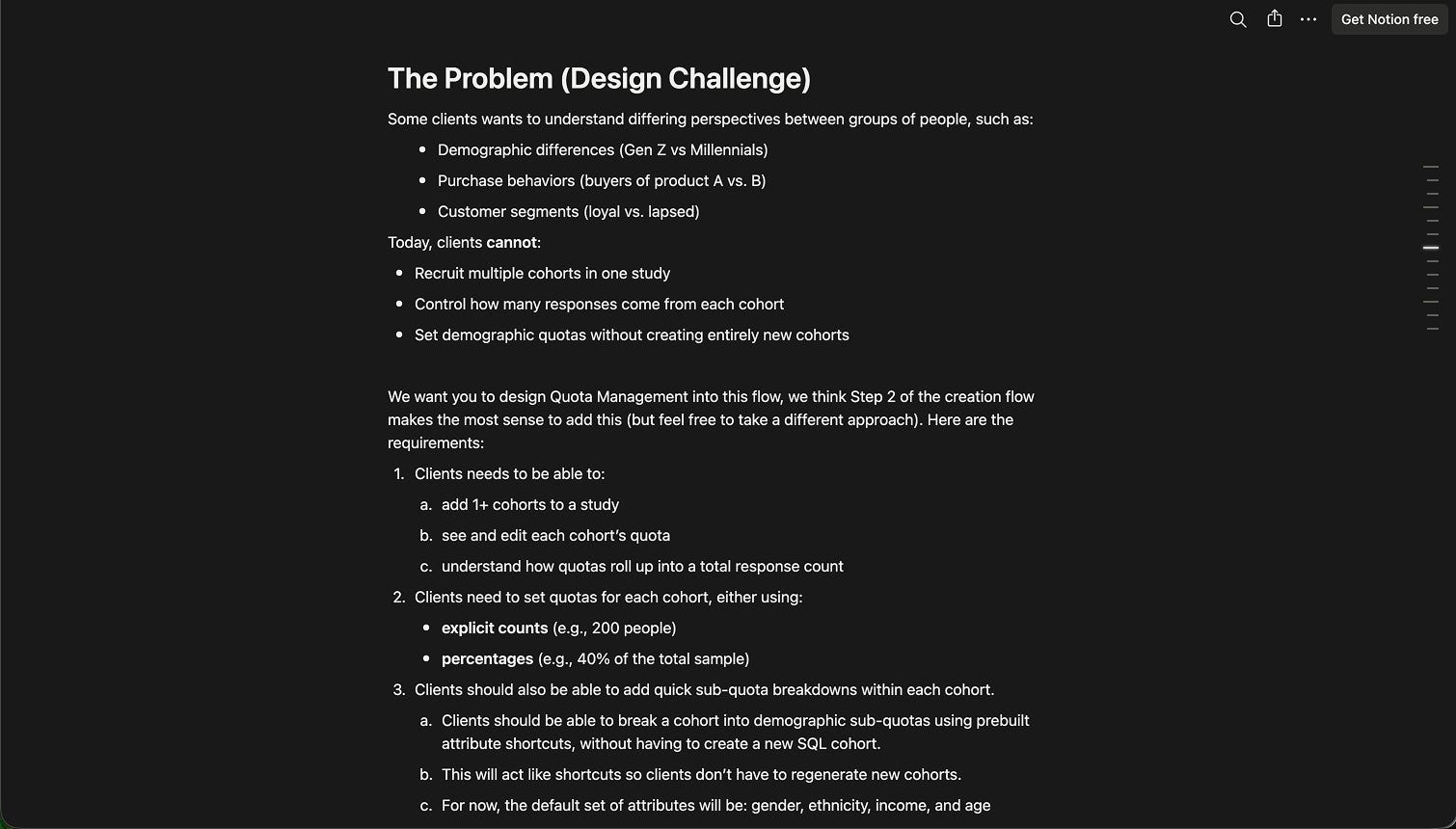
the mental model of users (Alex is designing a study, not looking at results)
the concepts/terminologies (cohort vs quota vs sub‑quota vs attribute)
the system constraints (1+ cohorts, demographic attributes as shortcuts, feasibility as system‑generated, percentages vs absolute counts, etc.)
This is so confusing! (っ- ‸ - ς) So I do what I do best? Ask stupid questions! AI is very tolerant of my questions.
Then I use AI for the “stupid questions” phase.
I paste the brief into an LLM and ask things like:
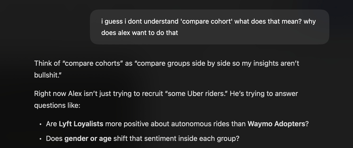
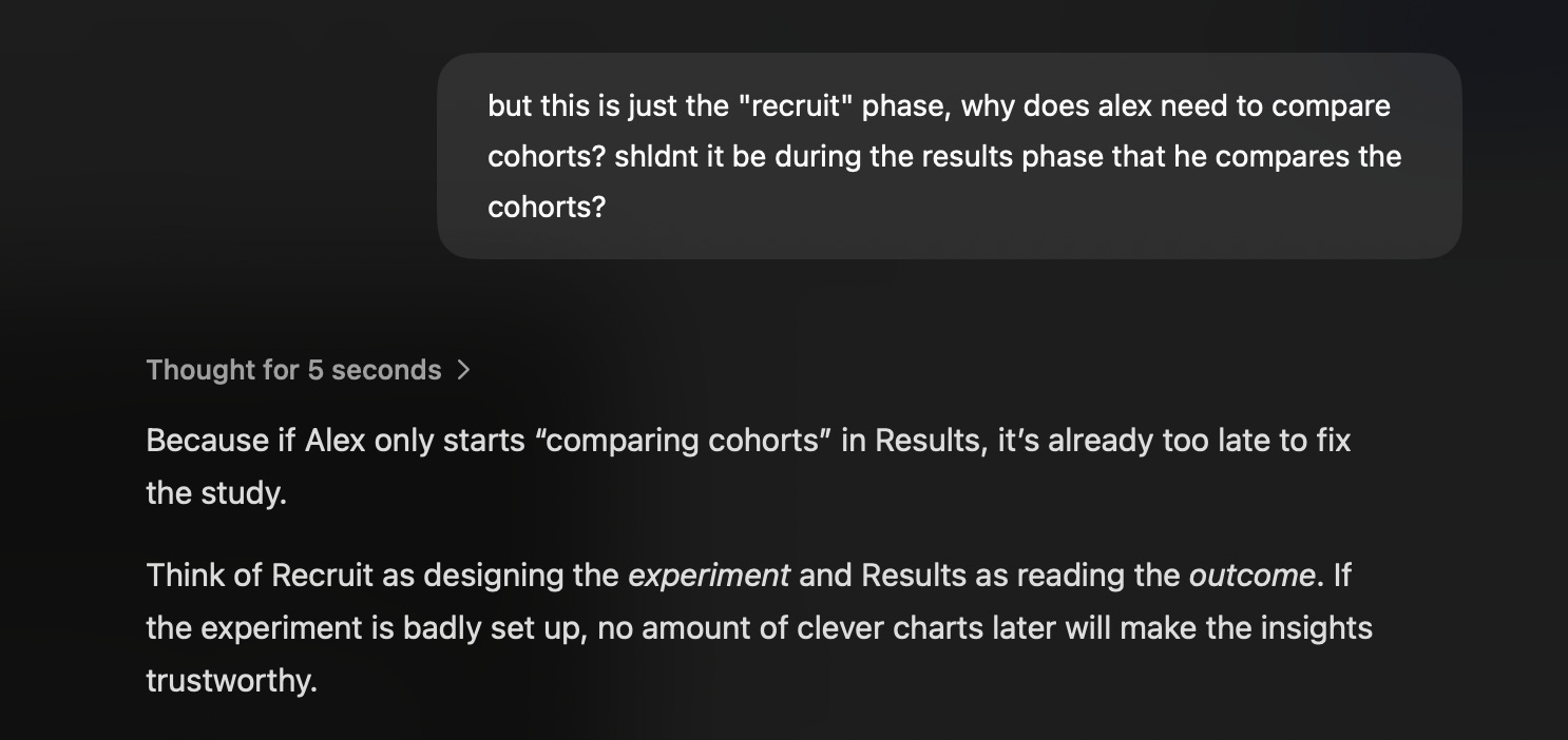
“I guess I dont understand ‘compare cohort’ what does that mean? why does Alex want to do that?”
“Explain the difference between cohorts, quotas, and sub‑quotas using the rideshare example.”
“What are the failure modes here? Where can this experience break down for a non‑technical director?”
It’s about having a patient partner to bounce my understanding against. (ㅅ´ ˘ `)
I’ll paraphrase back:
“Oh, so when Alex sets 60 Uber / 30 Lyft / 10 Waymo, that’s at the cohort level. And if he wants 50/50 gender in each, he does that inside each cohort as sub‑quotas. Any leftover unassigned responses get auto‑allocated from eligible participants. Is that correct?”
If the AI can’t explain the system clearly, or if I find contradictions, I’ll need to make sure to clarify.

Now that we are aligned on the definitions, we can begin to get some ideas.
—
Step 2: Let AI go wide on layout so I don’t have to
Once I’m confident I understand the problem, I get lazy on purpose. (ㅅ´ ˘ `)
I exported the take‑home as a markdown file and fed it into a bunch of “AI for product design” tools and workflows.
Design Tools I experimened with:
v0, Magicpath, Gemini, Figma Make, and a custom skill I cloned from 0xDesigner’s Skills.md to run with Claude Code, inside Cursor.
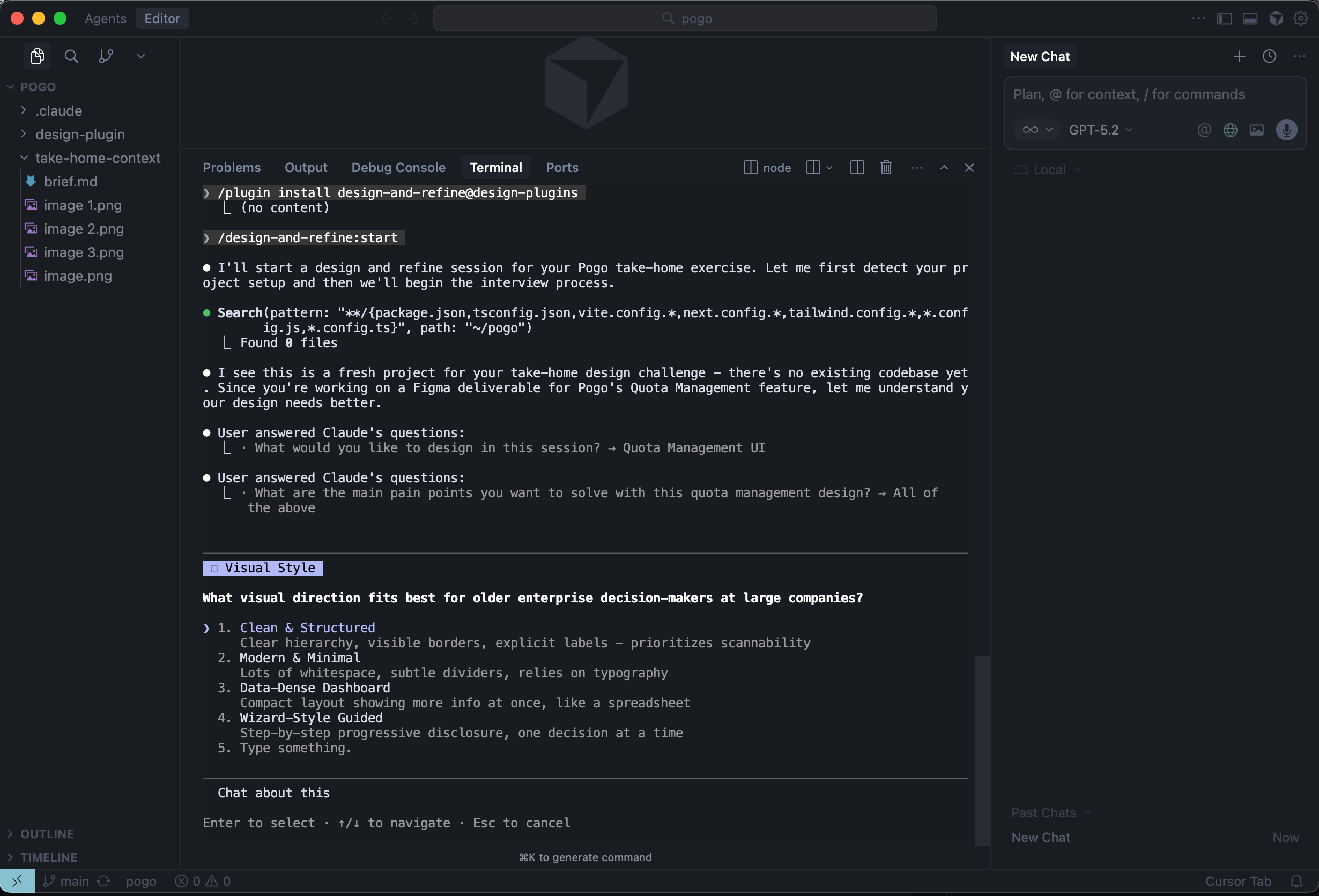
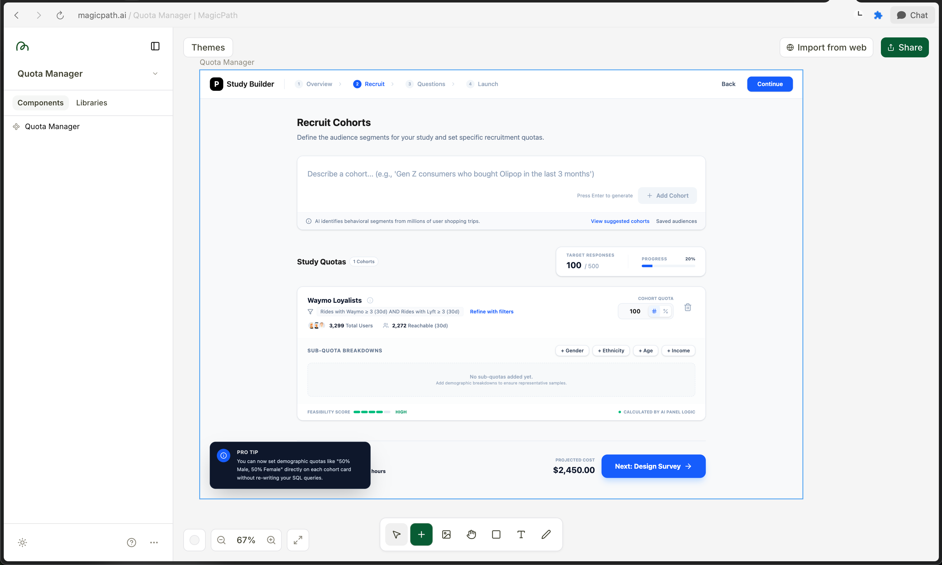
MagicPath
Promptwise, I give them:
the ICP (Alex: senior director, non‑technical, infrequent user)
the key jobs to be done in this step (add cohorts, assign quotas, see roll‑up, set sub‑quotas)
the constraints (older users, no hidden scroll, system‑driven feasibility, auto‑allocation behavior)
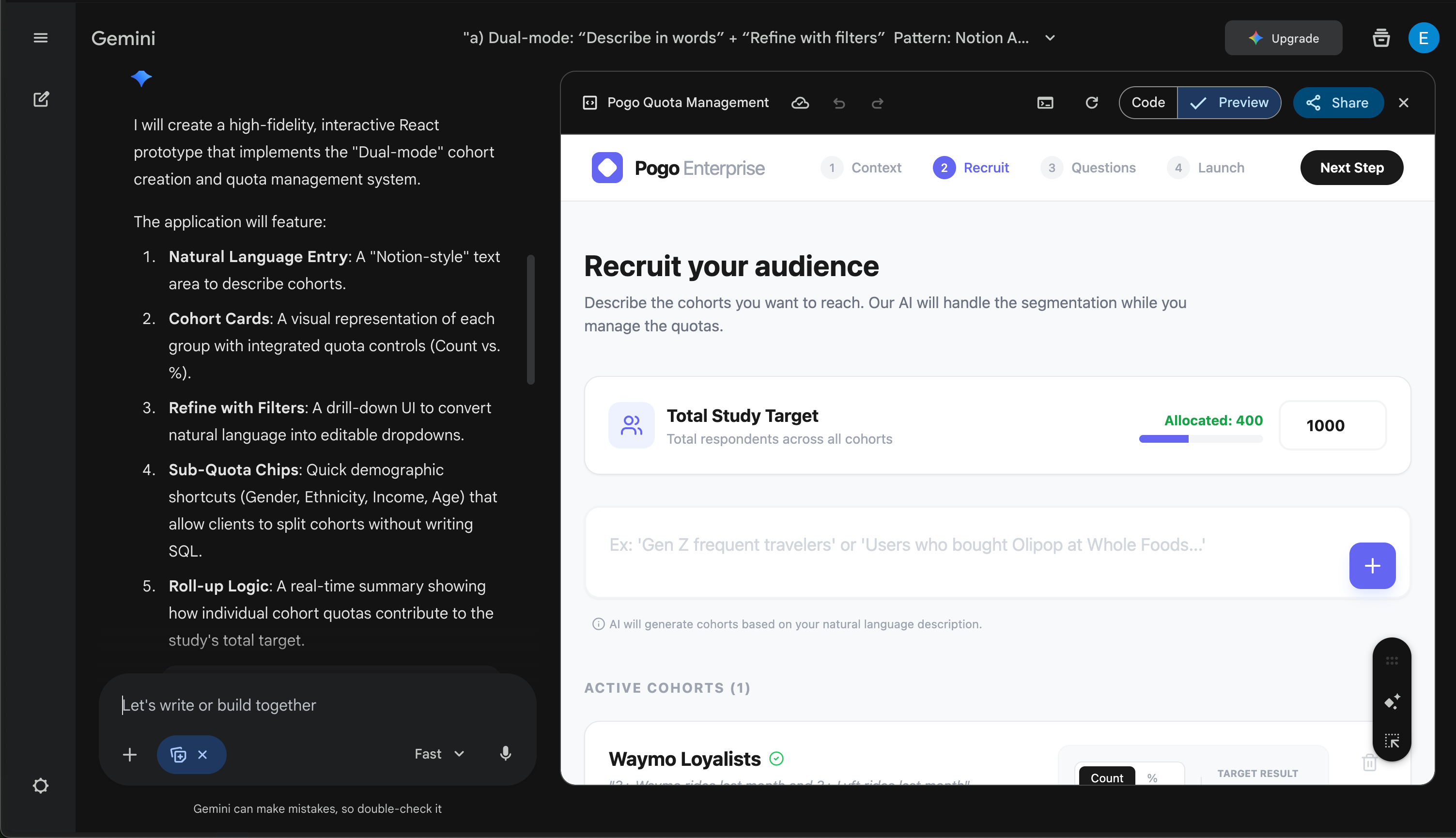
And I ask them to propose flows / screens for Cohort & Subquota Management
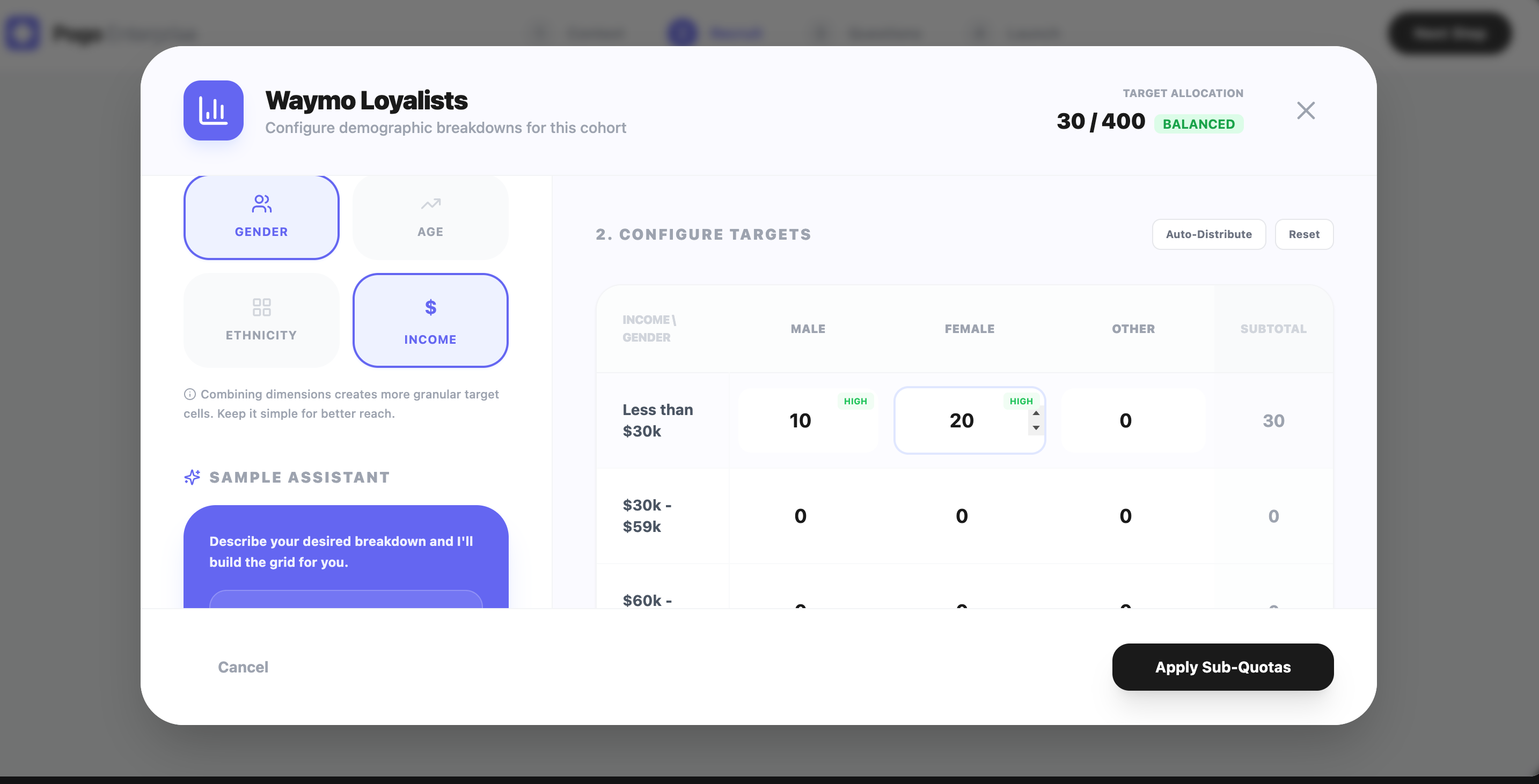
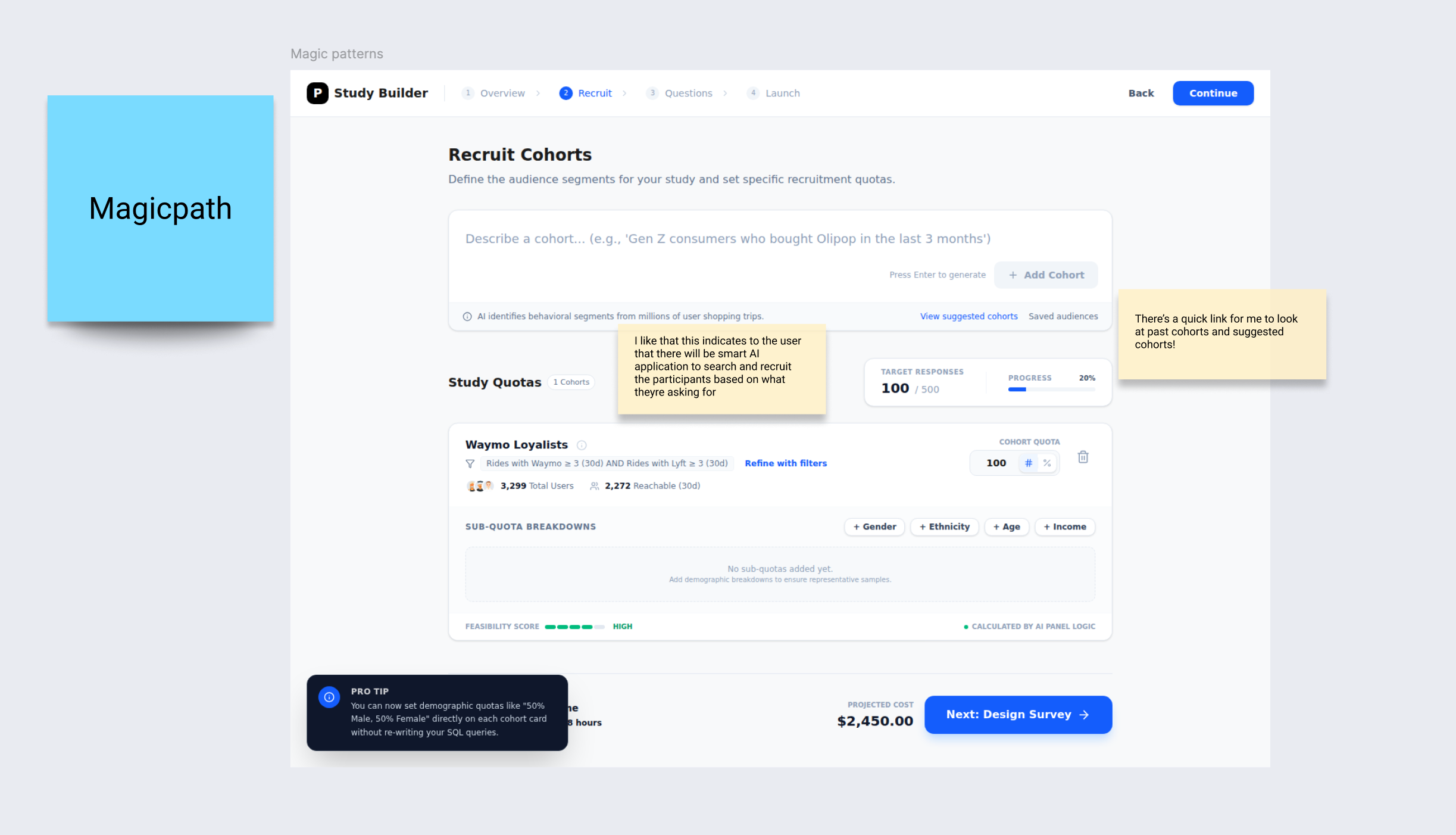
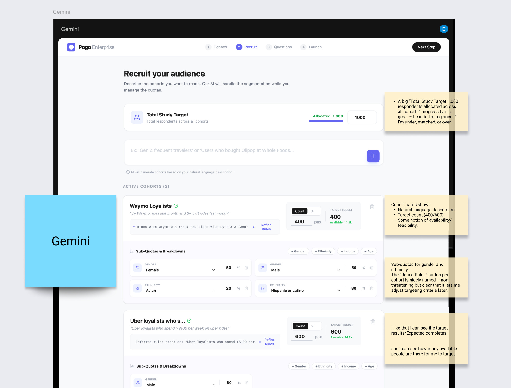
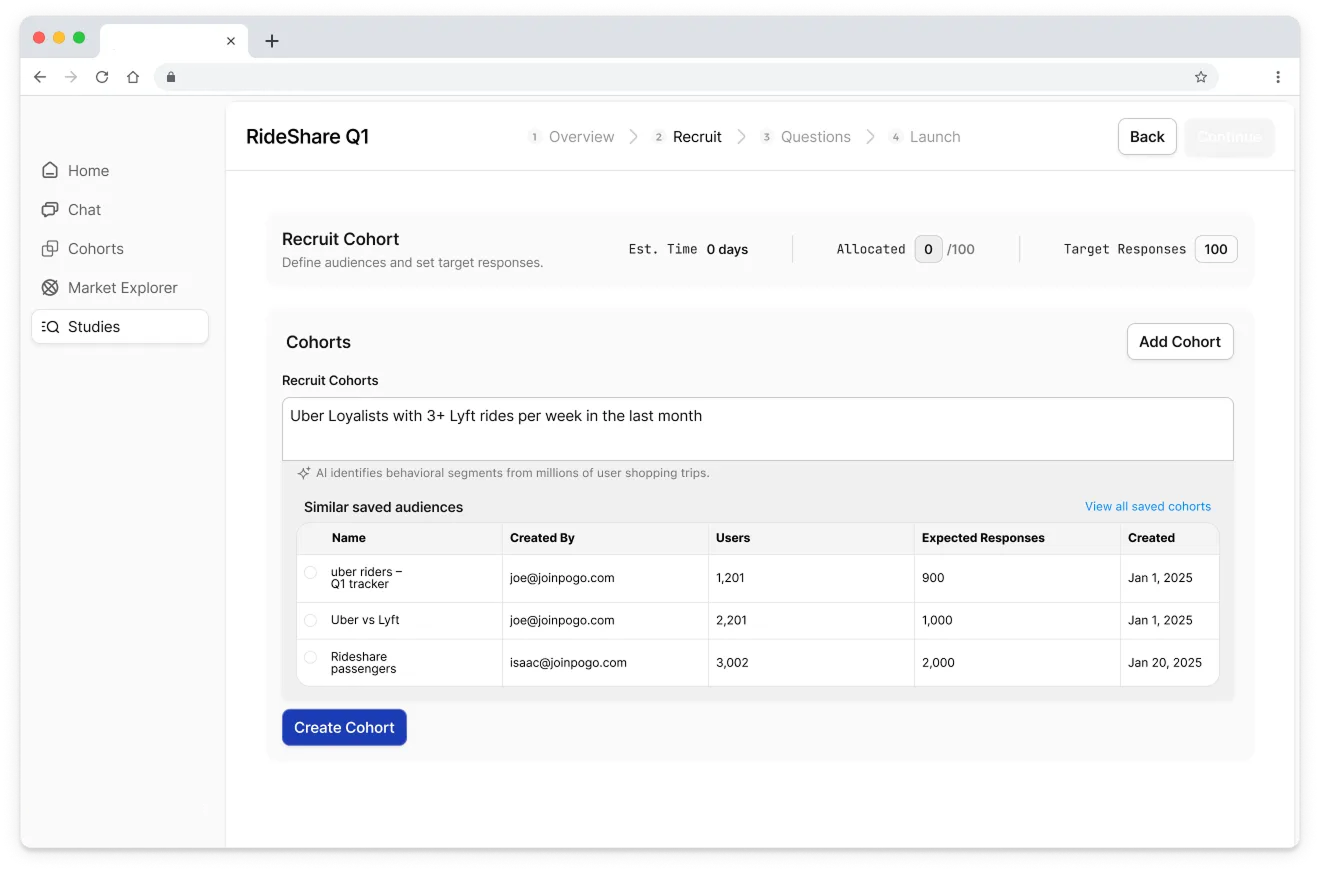
𖡼𖤣𖥧𖡼𓋼 AI Generated Designs Round 1 𓋼𖤣𖥧𓋼𓍊
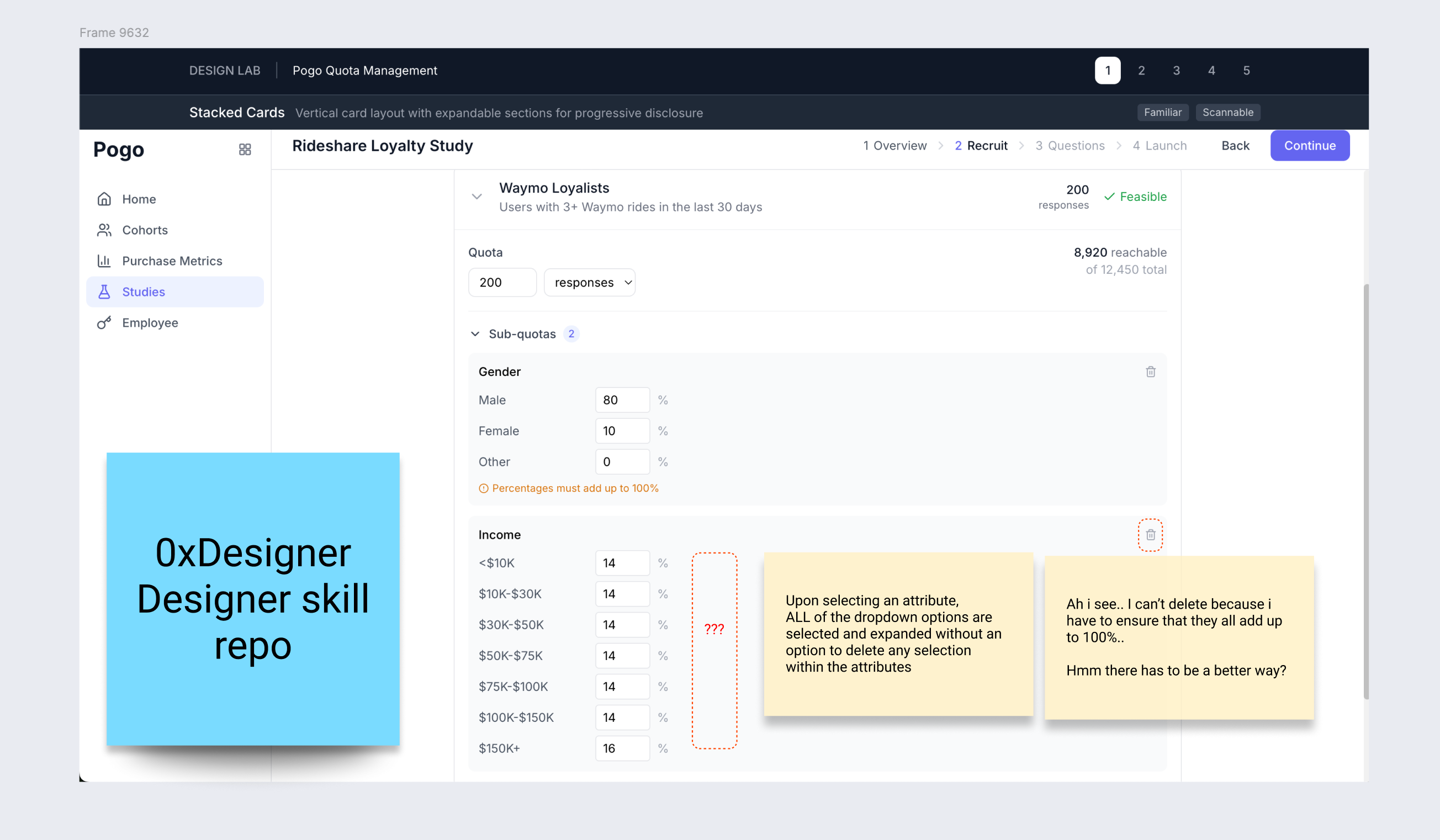
Most tools look very tailwindcss / ‘a developer made this’ dashboard. Dense tables, compressed typography. Most did not meet the requirements:
Users cant break a cohort into demographic sub-quotas
Immediately overwhelming older users
Copywriting does not match user’s mental modal - what does ‘sub-quota’ even mean?
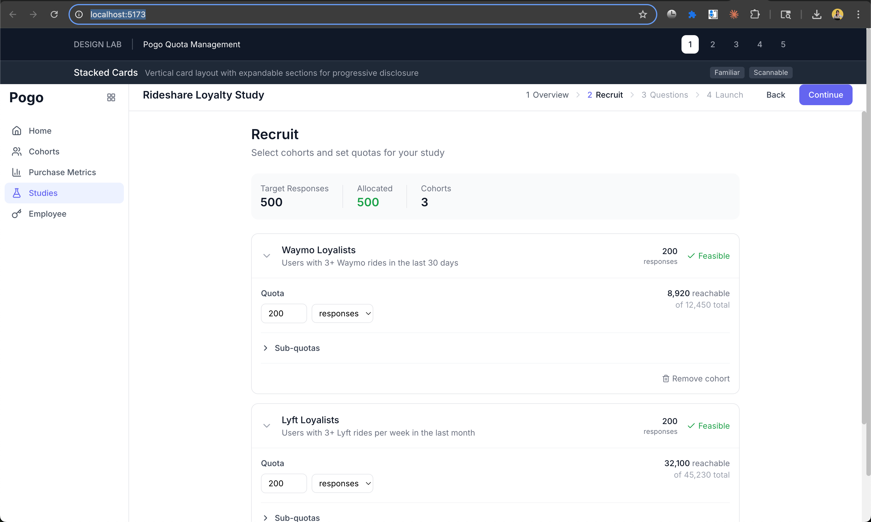
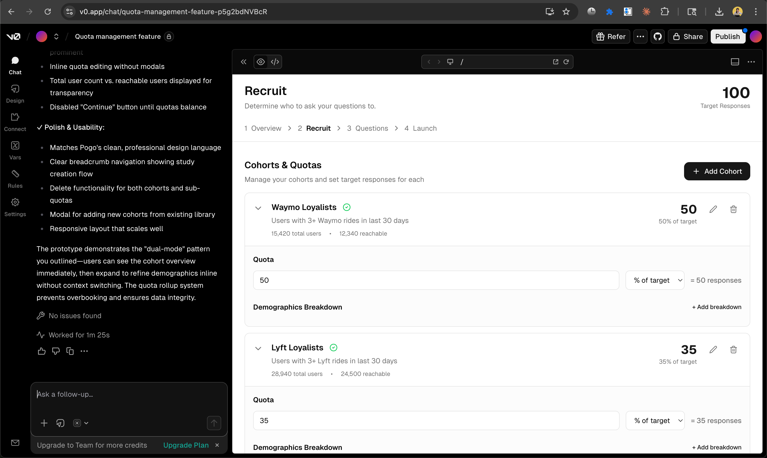

None of them worked (˚ ˃̣̣̥⌓˂̣̣̥ )
All of the designs ignored the requirement:
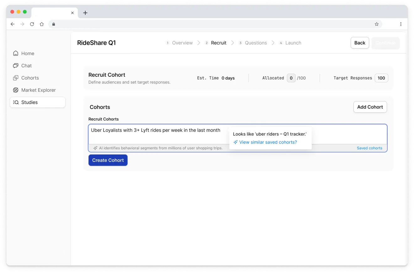
Clients should also be able to add quick sub-quota breakdowns within each cohort.
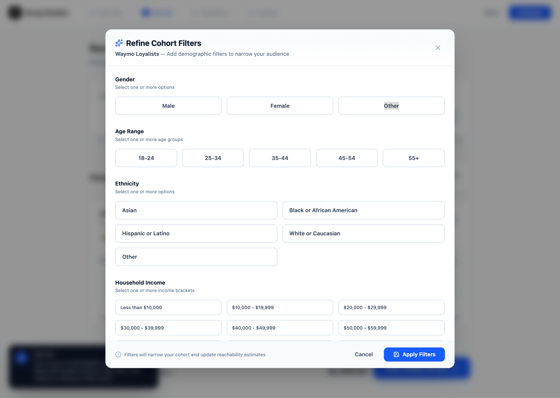
Clients should be able to break a cohort into demographic sub-quotas using prebuilt attribute shortcuts, without having to create a new SQL cohort. For now, the default set of attributes will be: gender, ethnicity, income, and age
Ok so naturally, let’s tell the AI they didn’t meet this requirement and let’s see what designs did they come up with.
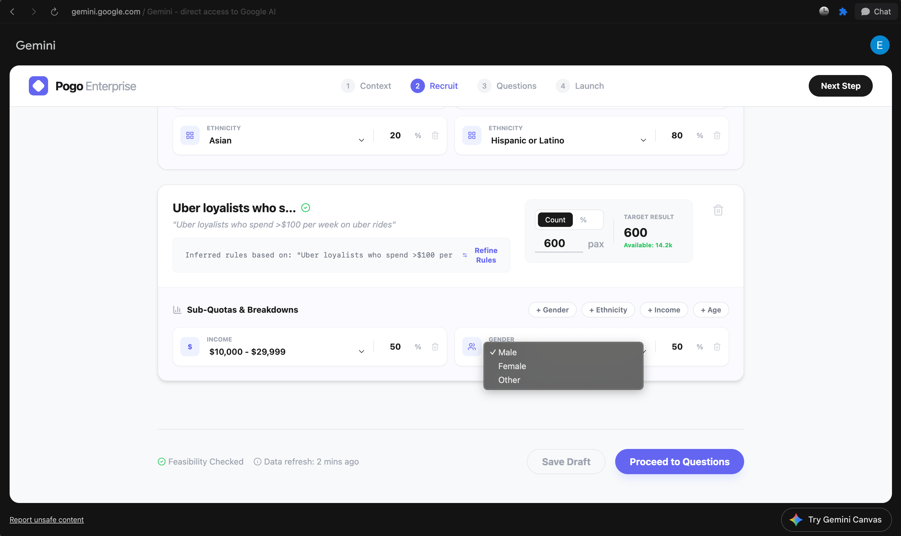
AI’s Generated Designs Round 2 ✌︎( • ̀ω•́ )✧
I prompted the AI design tools to strictly fulfill every requirements that they ignored earlier. Results: All of them designed this spreadsheet-like UI, where users customize each cell to set attributes of gender, ethnicity, income and age. (Surprisingly they all arrive at this same complex UI pattern I’ve never seen in my life ծ_Ô)
( ಠ ᯅ ಠ ) That’s crazy… no user is going to even spend a brain cell to use this interface.

To be fair, I’m not expecting any of these to be “the answer”. I’m using them as a way to quickly see 5–10 different structural takes on:
How do you organize study‑level vs cohort‑level info?
Is this a table? A card list? A hybrid?
Where do feasibility and “participants reachable” live?
How do you surface sub‑quotas: inline or in a modal?
How do you expose “percent vs absolute count”?
So… what now? We utilize the designs as ideas! ✎ᝰ.ᐟ⋆⑅˚₊
Draw inspiration from generated designs + Writing notes ✄
I make notes on what works and what doesn’t, and draw ideas from the designs.
For example: When I saw that one of the generated design decided to automatically equally allocate the responses, instead of requiring the user to start from 0, it sparked even more questions I had for the users I’m designing for:
How granular do they want to allocate the responses per attribute?
Step 3: Evaluate the AI designs as the ICP (╭ರ_•́)
This is where the work of a designer comes in again.
I put on my Alex (user’s) hat and walk through each AI‑generated interface like I’m trying to set up my own rideshare study.
I ask very practical questions:
At a glance, do I understand:
how many total responses this study is targeting?
how many are assigned to each cohort?
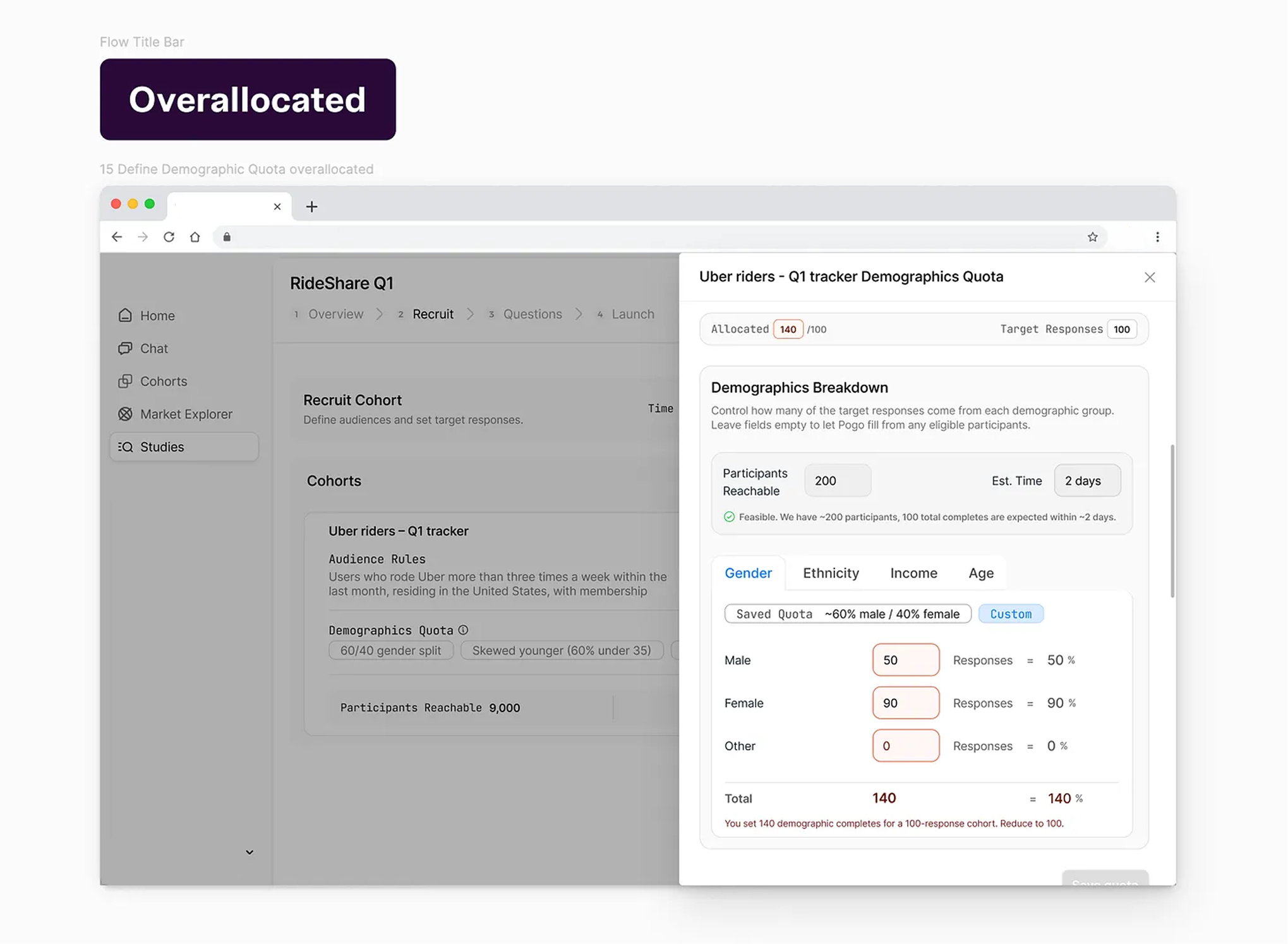
whether I’m over‑ or under‑allocating cohorts and sub‑quotas?
whether this is fieldable/feasible?
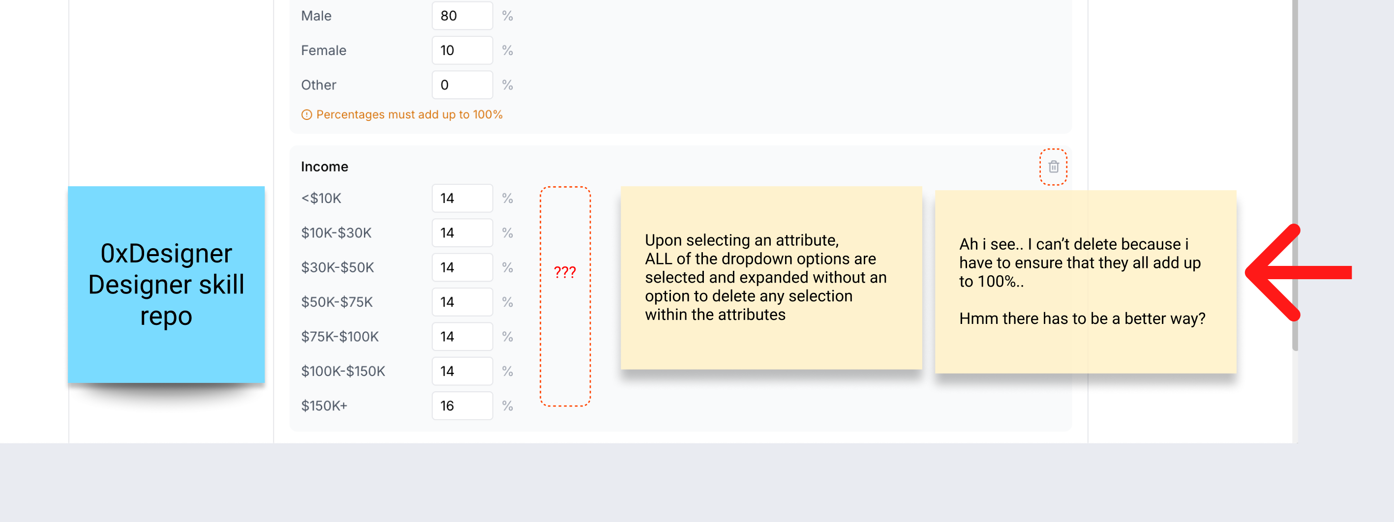
I annotate the screenshots with digital sticky notes ✎
“I don’t know how this rolls up into 100 total.”
“This assumes I understand personas like ‘Urban Gen Z Low‑Income’ — but Alex thinks in attributes.”
“They’ve hidden feasibility in a hover tooltip; bad for trust.”
“Too many tabs: I lose the mental model of ‘one cohort, multiple attributes’.”
We get very clear what is the primary use case vs secondary use case
This is where using AI as a generator is only half the story. The value is in being able to critique it ruthlessly through the lens of: does this work for this ICP, in this context, for this system?
At this point, I form a strong opinion of what a great product looks and feels like for the ICP.
Typically in a real design process, I would form some sort of alignment with the team to ensure we’re on the same page on the opinions we have on how we want to serve the customers. For example: I definitely don’t think making users do the math on a user research web app is the ideal ux.
What this looks like:
This could spin into a brainstorm session with cross functional team + engineering to figure out better UX for users to ensure all the fields add up to 100% with the least cognitive load.
Forming UI logic based on use cases.
Step 4: Identify the UX patterns I actually need ✄
Once I have a pile of AI‑generated UI and my own notes, I zoom out and ask: what UX patterns am I actually solving for?
Things like:
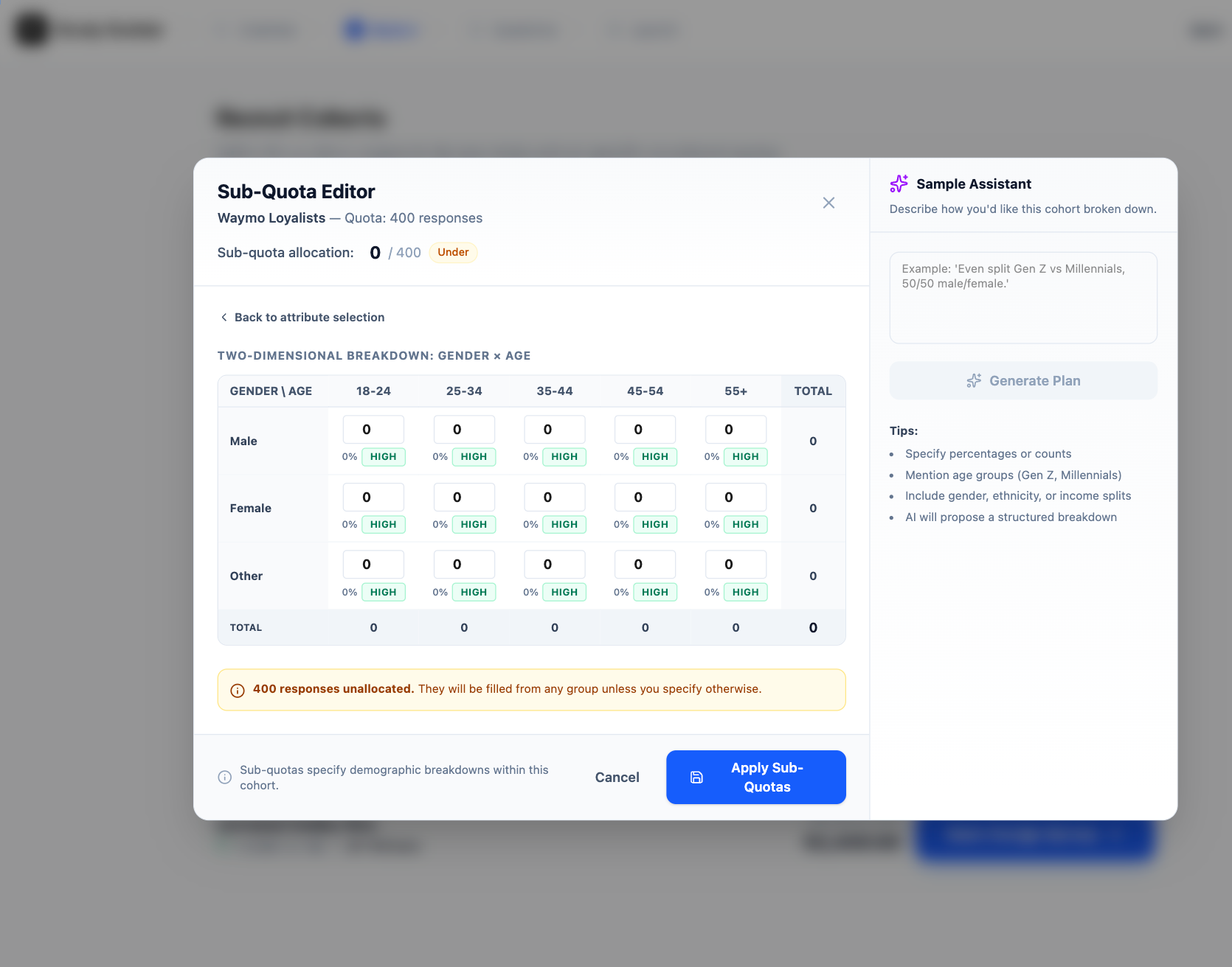
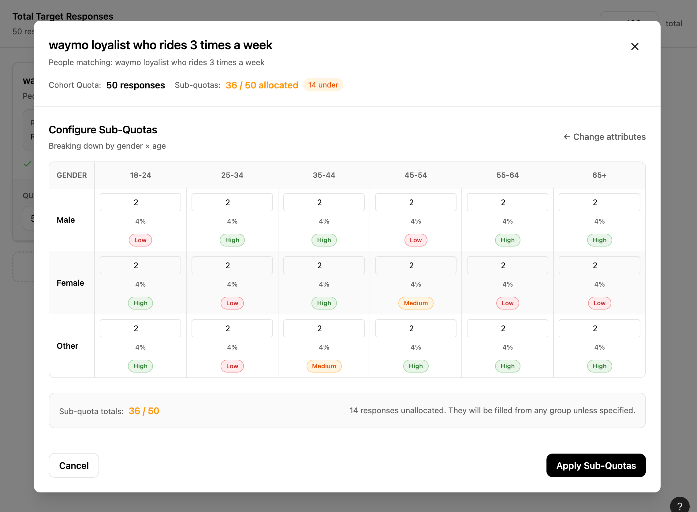
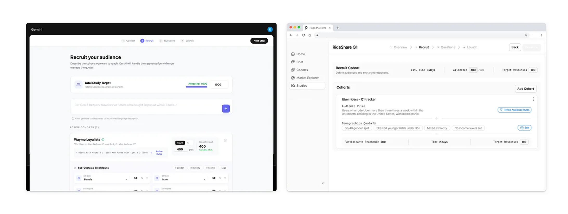
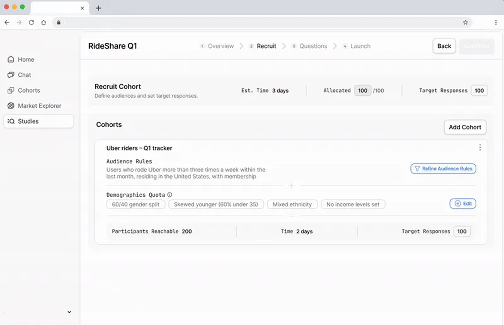
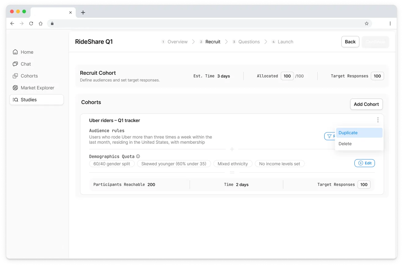
Multi‑cohort allocation: overview table with study‑level total at top, cohorts as rows, each with target, allocated, feasibility, and a demographic summary.
Drill‑down configuration: a breakdown view per cohort where all sub‑quota attributes (gender, age, income, ethnicity) live in one place.
Error handling patterns: over‑allocation (blocking, explicit messaging), under‑allocation (allow, explain auto‑allocation).
This is when I switch to pattern libraries like Mobbin, but in a very specific way. I filter not just by “industry” but by:
flows like “create group”, “allocate resources”, “configure filters”
interaction patterns like “search + filter tables”, “inline editing”.
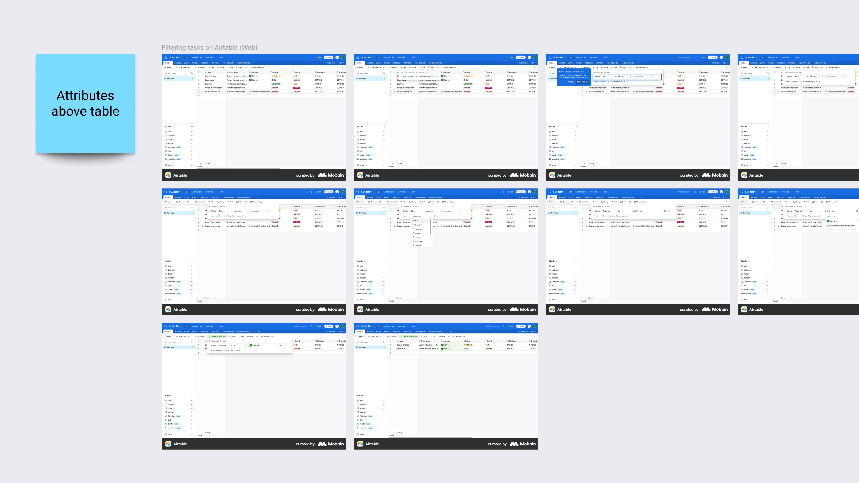
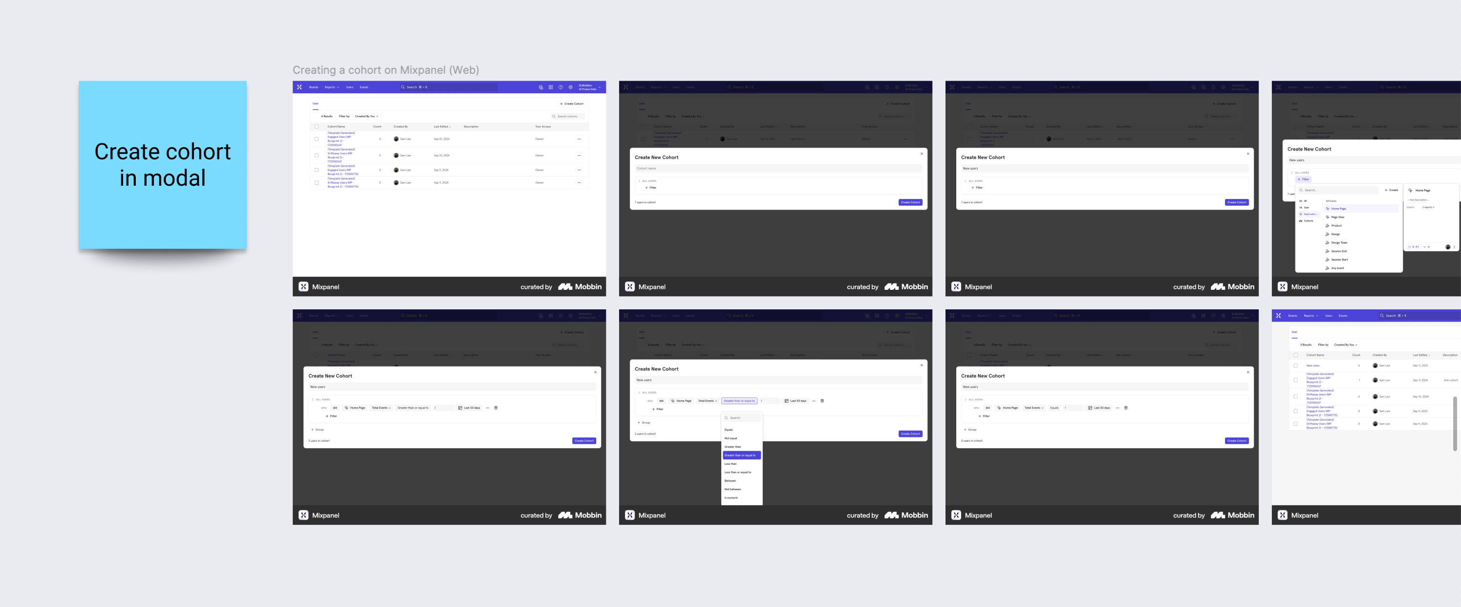
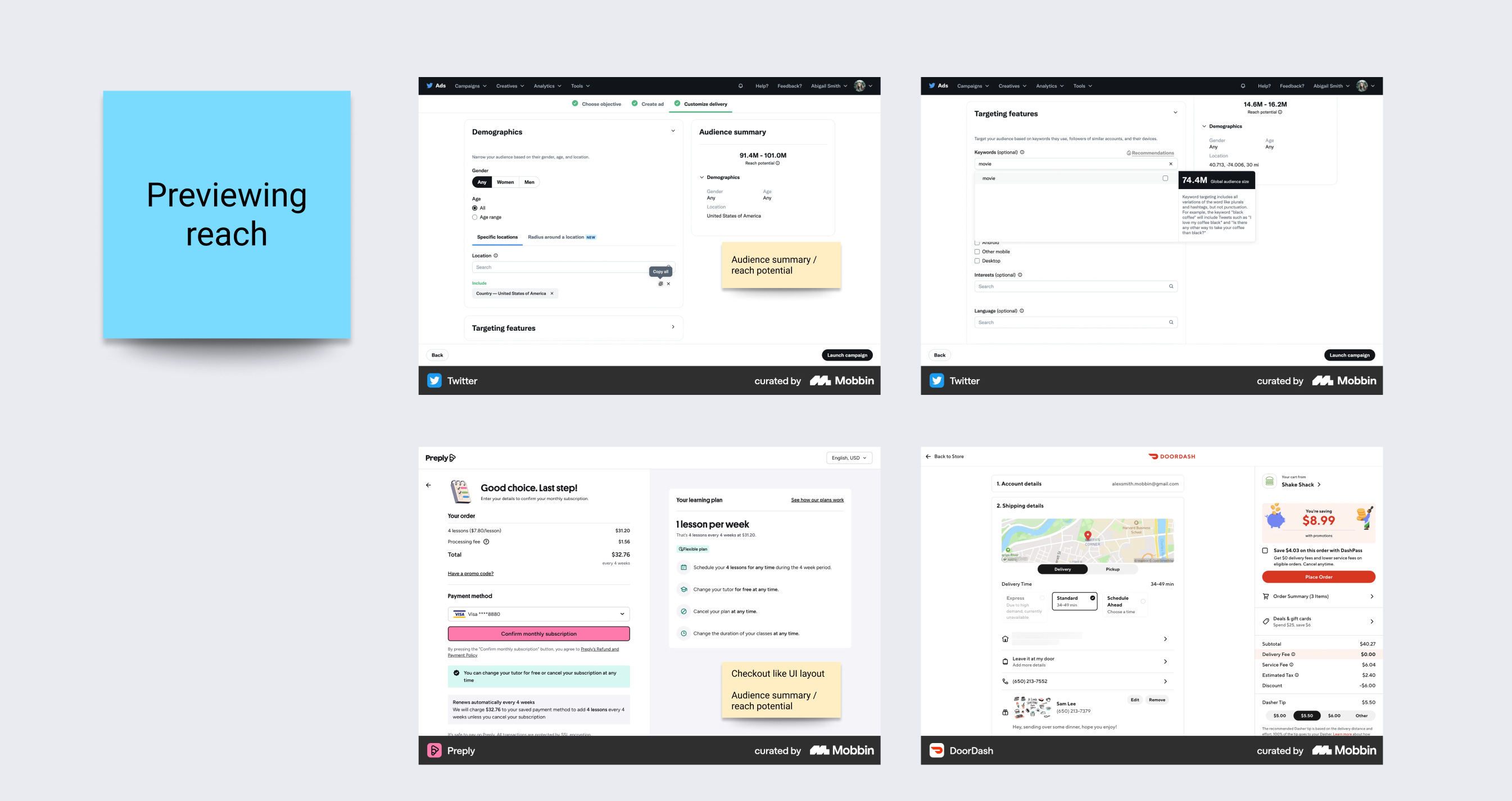
I’m not trying to find a “quota management” clone. I’m looking for: how do mature products handle similar cognitive load and risk?
For example:
how ad platforms handle budget allocation across campaigns
how analytics tools let you create cohort
how complex enterprise apps show “allocated vs remaining”
AI helped me widen the space, pattern research helps me deepen it.
Step 5: Design with explicit decisions (and use AI as sounding board) ⌞ ⌝
At this point, I’ve seen enough to start making calls. This is where AI is useful as a discussion partner, not as a generator.
Some concrete decisions I ended up with, and how I used AI around them:
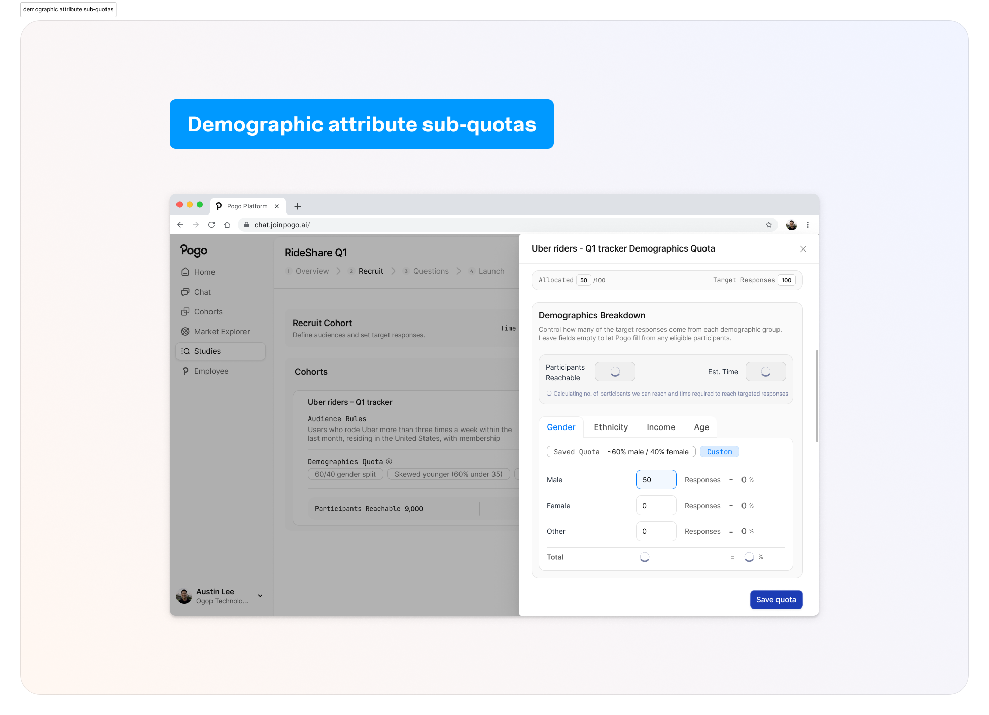
Persona‑based vs demographic attribute sub‑quotas
AI tools loved persona‑style slices (“Gen Z low‑income urban riders”).
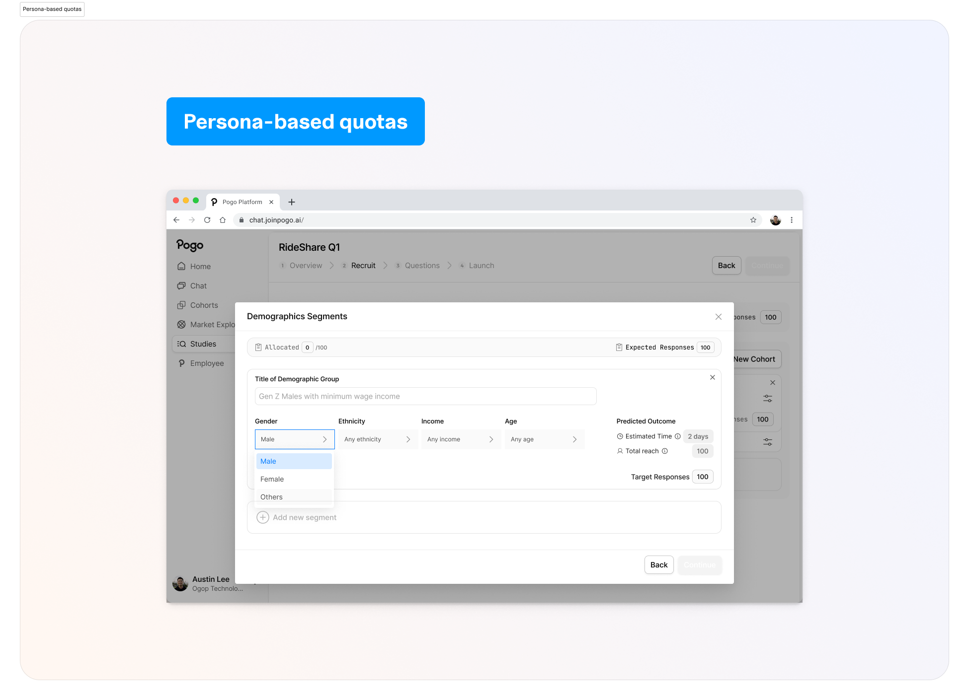
Target Persona Group VS Defining Attributes
Attribute sub‑quotas are about precise control and trust. I want Alex to see concrete numbers and percentages he can adjust, not an AI making opaque suggestions for “balanced representation”.
I used AI here to simulate user reactions with research:
“If you were Alex and the system proposed demographic quotas for you, would you trust them?”
“What copy would you need to see to feel safe adjusting these?”
E.g, Demographics VS Audience
I’m now able to definitively conclude with system logic behind how the UI is displayed ⑅˚₊
Calibrating the level of automation vs control.
Handling allocation math
One of the biggest value props of AI for designers is: not doing manual math.
I design the UI so Alex sets intent (“50% male, 50% female”, “skew younger”), and the system:
shows live subtotals (“Subtotal: 80 / 100”)
blocks invalid states (>100% or >cohort target)
clearly explains under‑allocation (“50 / 100 allocated; 50 will be auto‑filled from eligible participants”)
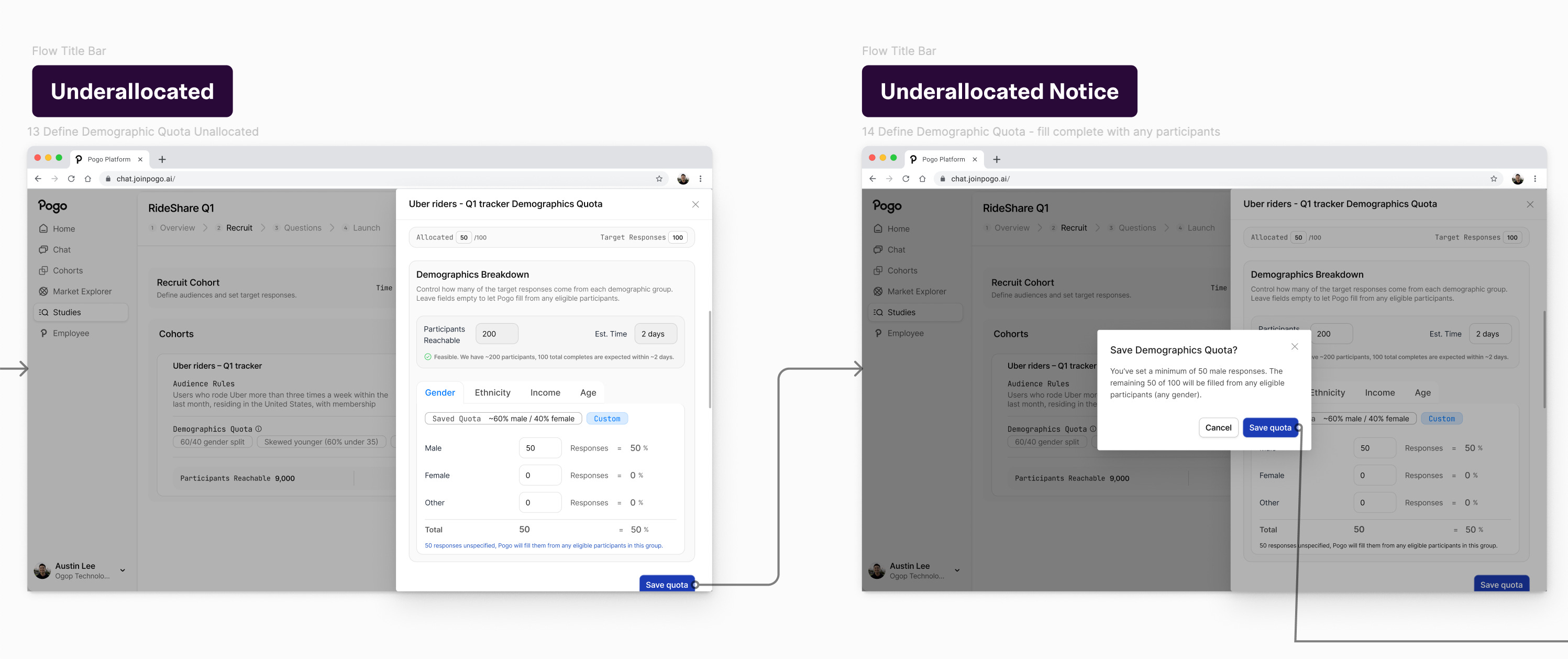
I use AI to generate edge cases, and that feeds back into the error and warning states.
—
Step 6: Use AI to stress‑test assumptions, personas, and flows (⊡-⊡)و✎
Once I have a direction, I go back to AI, but now the prompt is very different.
I ask it to:
write a detailed persona and user story for Alex, based on the brief and a generic understanding of a Senior Director of Consumer Insights at a US rideshare company
generate realistic scenarios: “Alex wants to compare Uber and Lyft loyalists with similar income and age distributions but slightly different ride frequency. What questions does he ask in the Recruit step?”
critique my screens from Alex’s perspective: “Pretend you are Alex. Walk through this interface. What confuses you? What feels risky? What would you want to double‑check?”
This isn’t “user research”, but it’s good enough for a take home. IRL I would def check with user research, insights etc.
Problems with my designs that I’m specifically looking for:
points where the ICP might overestimate control (e.g., thinking feasibility numbers are editable)
points where the ICP might miss something important (e.g., not realizing sub‑quotas don’t sum to cohort target)
places where copy feels too technical (“fielding”, etc.)
Then I literally check my designs against them.
—
Step 7: Iterate: product decisions vs design decisions ✩
Throughout, I use AI to help separate product questions from design questions.
Product questions:
Should the app allow study‑level percentage quotas, or only cohort‑level percentages?
Should auto‑allocation be opt‑out (“fill the rest automatically”) or mandatory behavior?
Do we expose panel distribution vs planned distribution to highlight skew?
Design questions:
Is a multi‑row table the right default, or should we lead with cohort cards then add a summary bar?
Where do we place “Participants reachable” and “Estimated days” so they’re visible but not overwhelming?
Is sub‑quota editing inline or in a modal?
AI is good at brainstorming tradeoffs and surfacing “gotchas” for both, but only humans (and eventually, the team) can actually decide.
On the details side, I’ll use AI aggressively:
draft error messages and then I edit them down
propose variations of layout copy, then I A/B them quickly in my head
generate possible filter options or edge examples so I can test empty/zero/error states
—
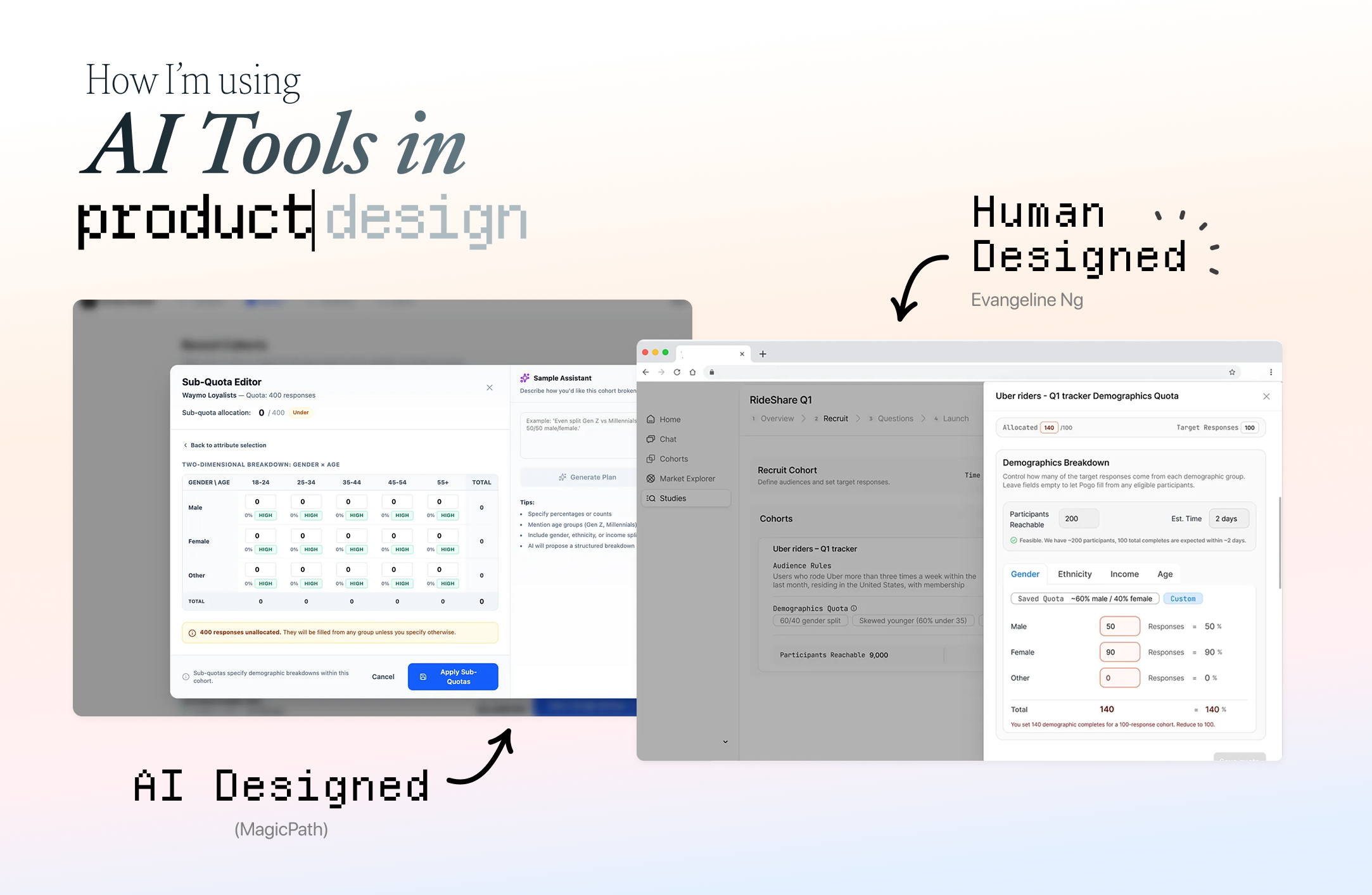
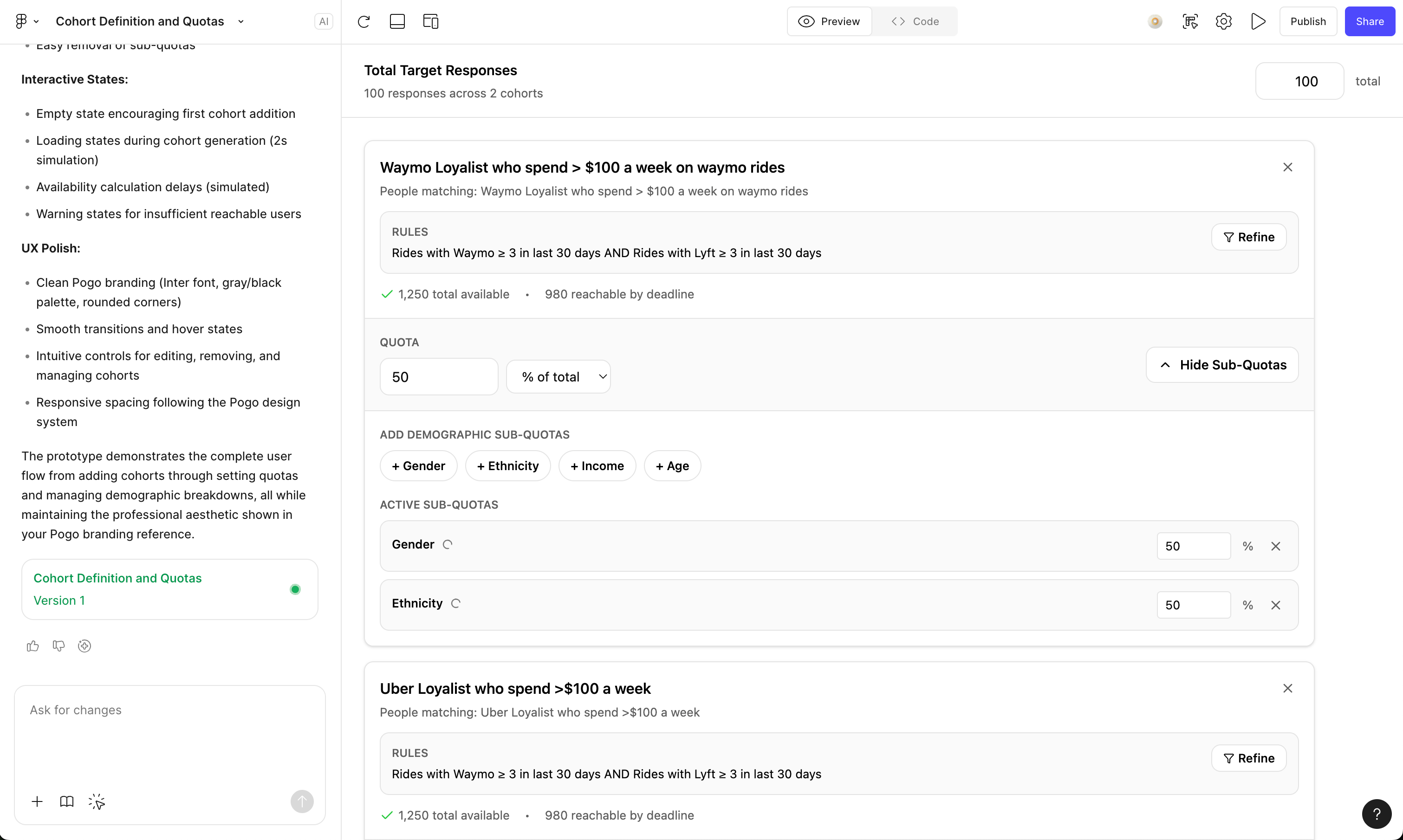
Let’s See The Results! AI‑generated vs final design
Left: AI‑generated designs from different tools VS
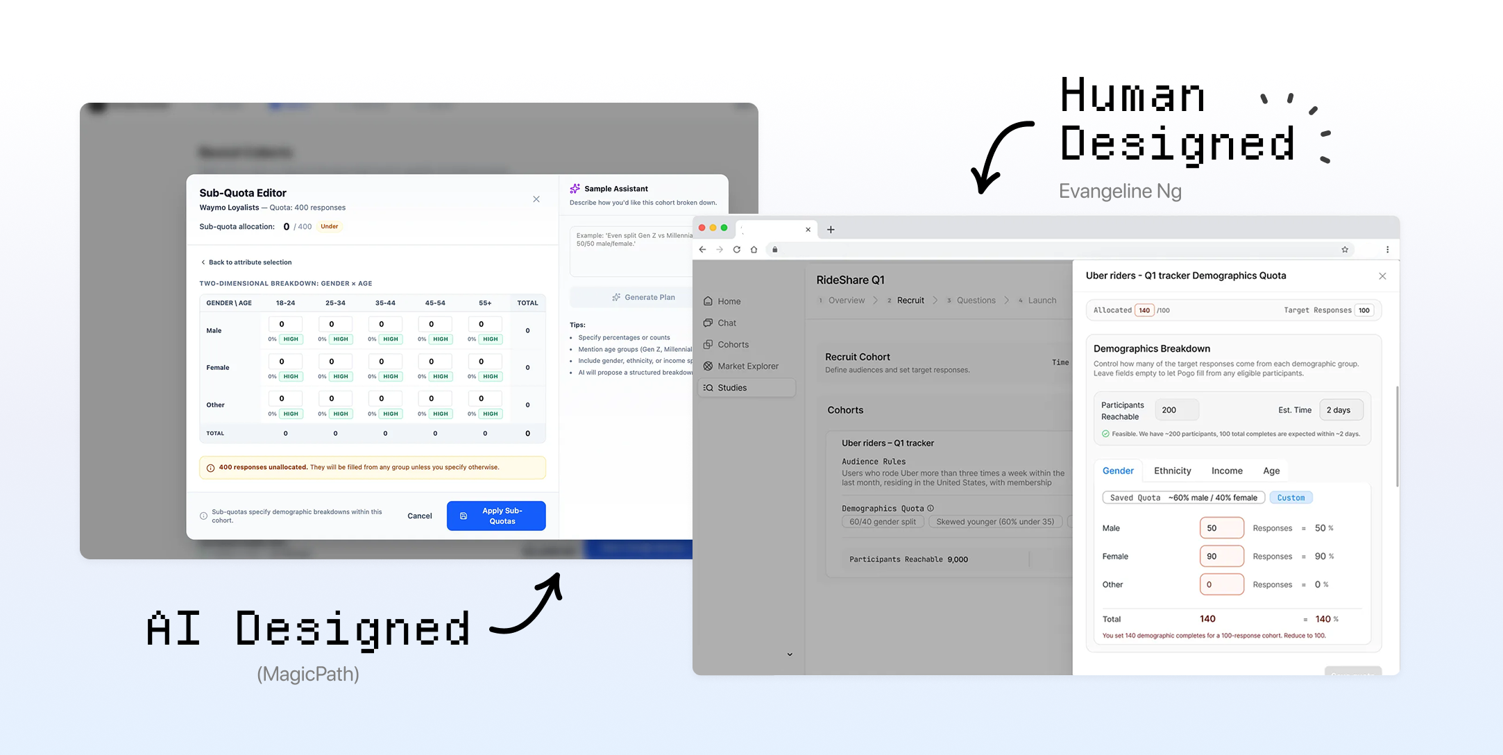
Final Design & Prototype (ง ˙˘˙ )ว♩
⟡ ⋆˙More Design Details ⋆˙⟡
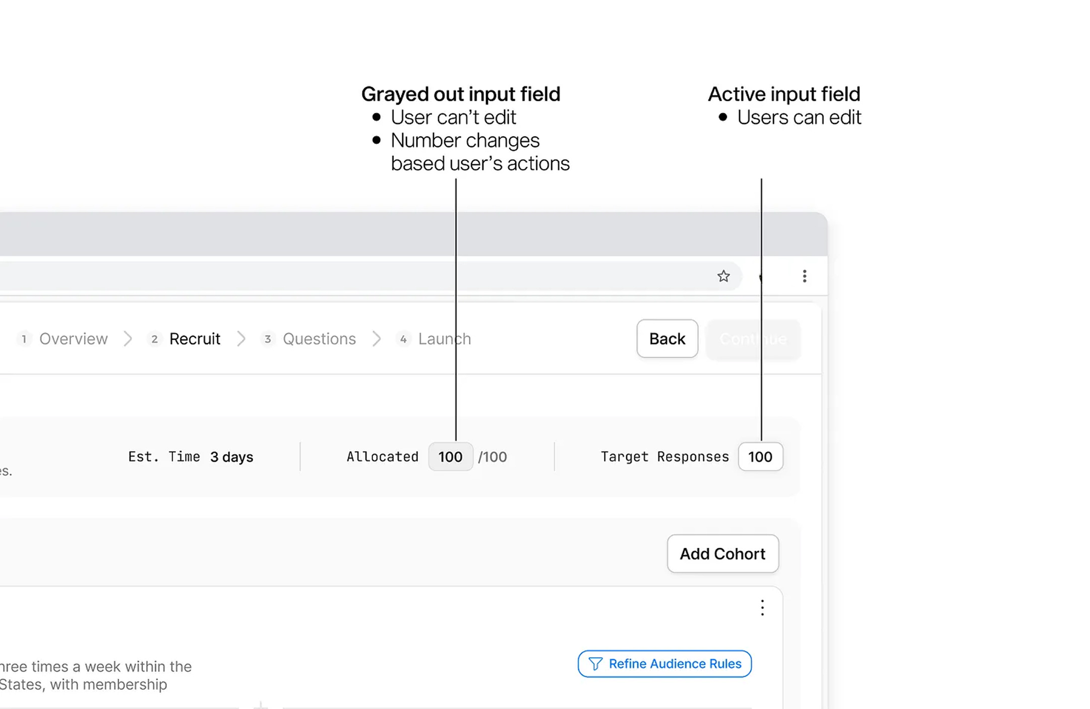
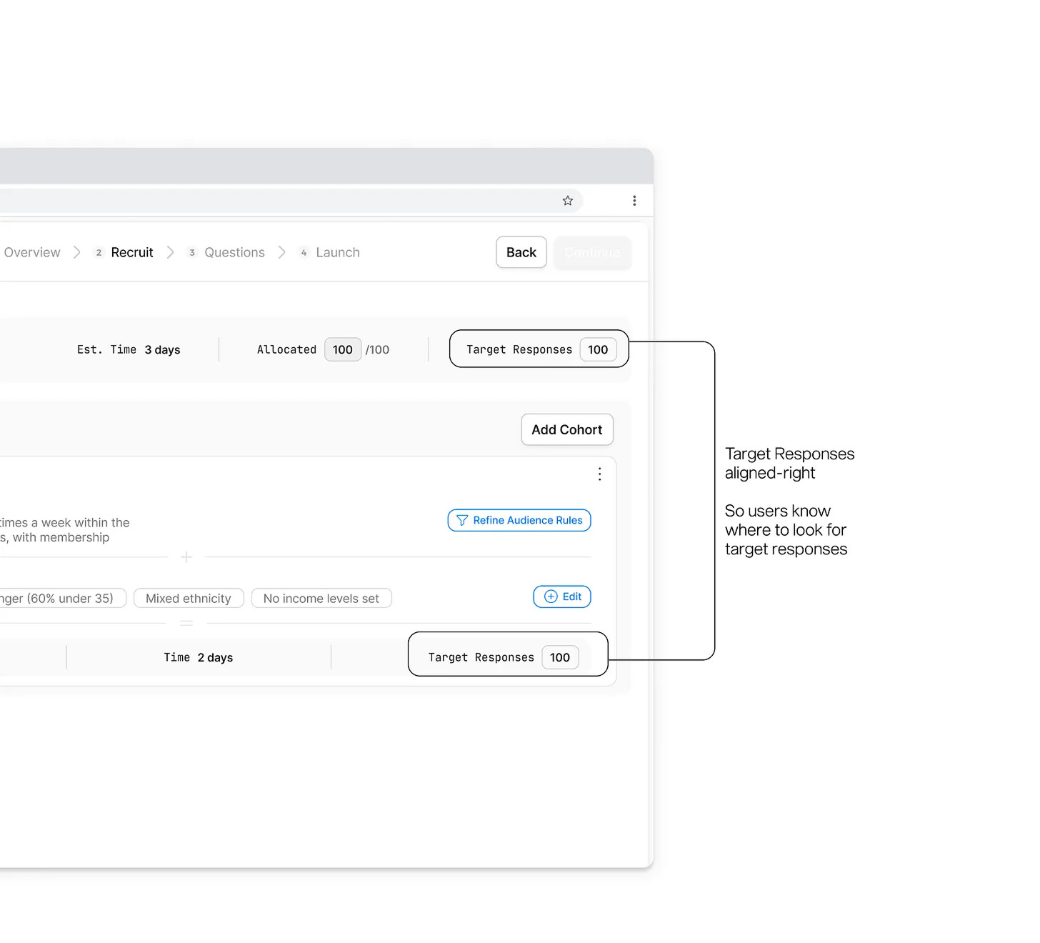
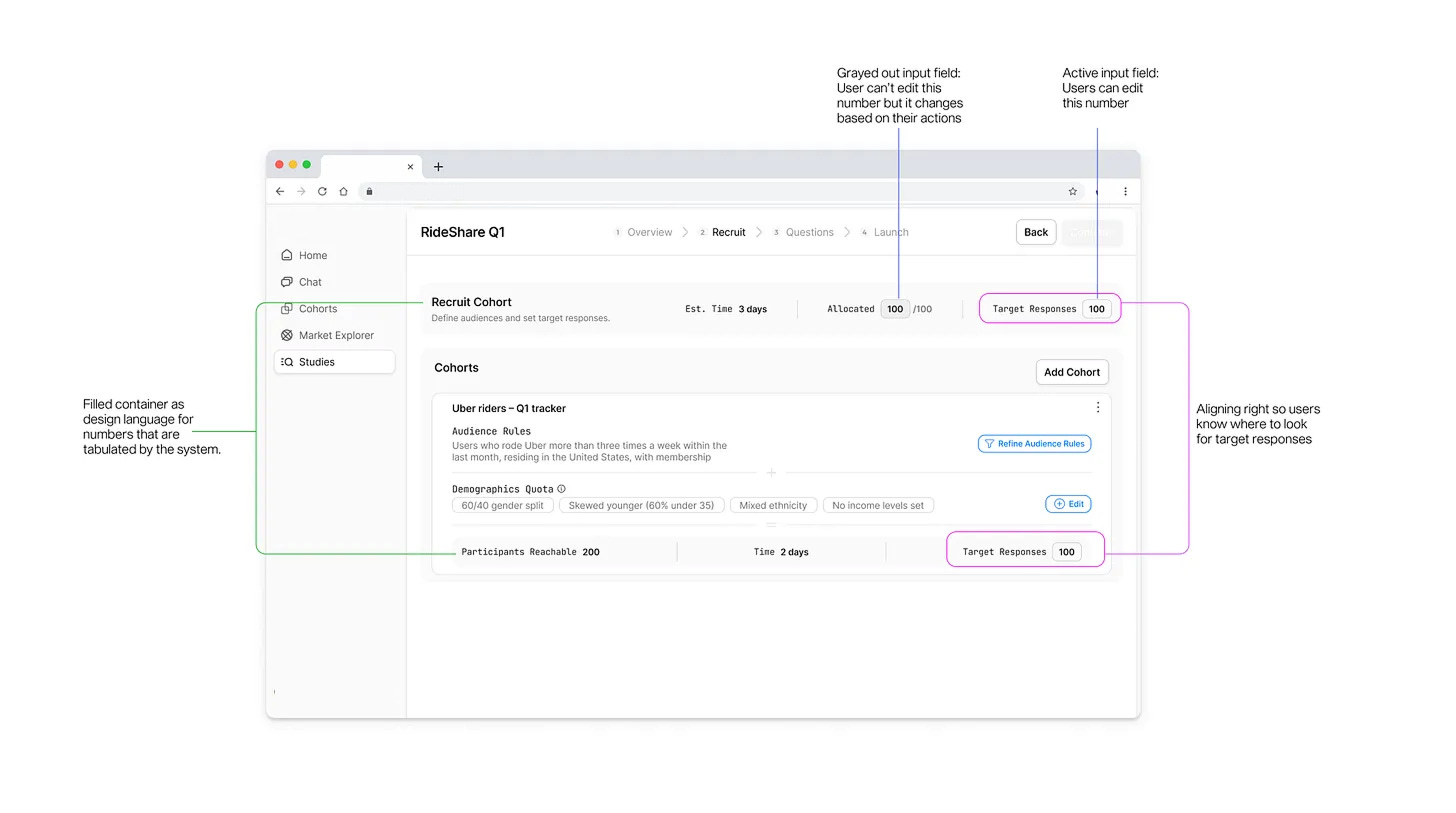
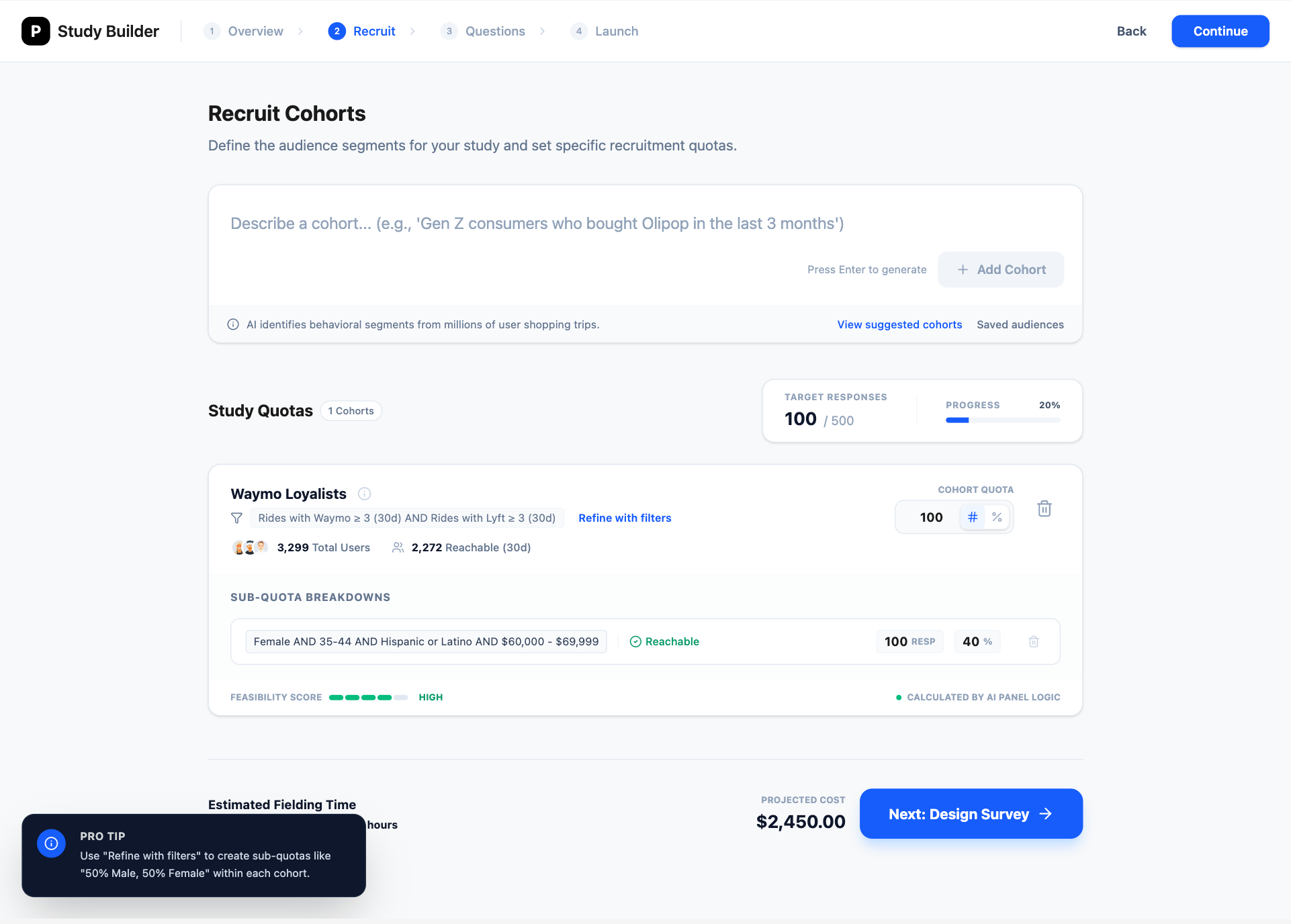
Final quota management design for the web app:
Multi‑cohort overview showing total target and allocations
Per‑cohort breakdowns with demographic sub‑quotas
Explicit over and under‑allocation behaviors
Feasibility outputs that update when quotas change
The differences between what AI designed VS human designed are:
Alignment to ICP mental model
Clarity of math and roll‑up
Trust and legibility of system behavior
Edge‑case handling
Prioritization of information for an older, infrequent user
Those are design decisions. AI helps me understand the ICPs, visualize options, and identify more failure modes faster. But it doesn’t decide what “good” is.
—
So, will AI replace product designers?
No ε-(´・`) フ
But it will absolutely widen the gap between designers who see the work as:
designing the end state and static screens
vs designers who treat it as:
a research assistant
a thought partner
a test harness to execute tasks (basically a playground that uses LLM to do different things such as agents, do tool calls etc)
agent simply means LLM + tools
a personal pattern library or component kit
a way to explore how other AI tools are using LLMs
Some of the people I see one common trait: Reinvention
Designers using Claude / Cursor to prototype actual interactions and test table components with real data, not just static mocks.
People like 0xDesigner, who ship their own “product designer skill” as a GitHub repo you can clone into your environment.
Designers like Brian Lovin openly sharing how AI has changed their design process, not just their outputs.
Benji Taylor built an agentic tool agentation where you can point at a UI and have a coding agent iterate on behavior, not just pixels.
The tools will keep improving. The bar for “decent UI” will drop. The bar for “thoughtful, trusted, behaviorally sound product design” will rise. If you’re a designer, the question isn’t “Will AI replace me?”
The question is: “When we see AI generated output, can we evaluative why it’s objectively not good enough? What does my design process look like when I assume AI is my default collaborator?”
In future pieces I’ll go deeper on:
how I’m seeing top companies and teams reinvent their workflow on “design + AI + engineering” as a blended practice
Try it out: Practice these on any public take‑home briefs, run it through your favorite AI tools, and design your own quota management flow. Here’s one that I found
Then compare what you got from AI on day 1 vs where you end up after you’ve layered your own judgment, taste, and understanding on top ⭑˚. 𓂃🖌️
Most importantly, don’t forget to have fun!
Many of you have reached out and I’ve been thinking of how I can provide the most value:
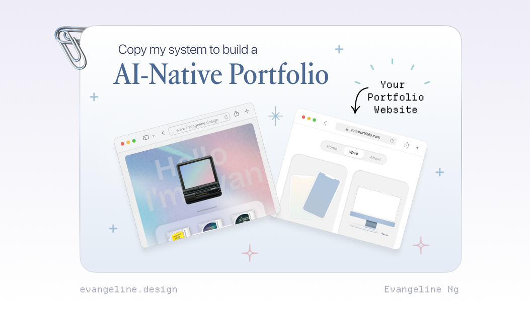
Build your own AI-Native Portfolio
I’m looking for a few people who want to build their own AI-Native Product Designer Portfolio.
Join the waitlist at www.portfoliopal.co ٩(^ᗜ^ )و ´-
and I’ll get in touch! You’ll be able to brain dump your Figma files, docs, threads privately → get it audited → have a Strategic Narrative → Live Portfolio Site 🎉
If you want to build an AI-Native Portfolio, please share the biggest blocker and I’ll reply to help unblock.
It’s not new that every week there’s a new “must-learn” tool, a new reason you’re “supposedly behind”. But most of us are busy with day jobs, solving real problems, and figuring things in our busy lives. Subscribe to my substack and let’s experiment weekly.
I got you. If you’ve been quietly collecting curiosity but lack time, this is our space to get the latest updates without the pressure.
We’ll start with small experiments we can actually build momentum from :)
Join the waitlist to build your AI-Native Portfolio at www.portfoliopal.co ٩(^ᗜ^ )و